■𝟷: Color theory, Clichés, and Bit-depth upscaling
“The problem with clichés is not that they contain false ideas, but that they are superficial articulations of very good ones. They are vague. The sun is often on fire at sunset and the moon discreet, but if we keep saying this every time we encounter a sun or a moon, we won’t be getting at our actual sensations.”
— Alain DeBotton
Color theory: the superstition that just won’t die
I bet I can show everything you know about Color Theory in only two charts.
Not just you. The charts show everything anyone knows about Color Theory. The field is tiny! I wanted to go deep. I put my head down to learn it all… and raised it again fifteen minutes later.
I think I learned all there is to know, and I put it into two charts.
If I’m right, there’s a problem, because the charts are both wrong. Which makes the whole field of Color Theory… superstition? A big lie? Whatever term will entice you to read on.
Here are the charts:
Color Harmonies and Color Psychology. There certainly is more to Color Theory than those two, but not for choosing color. If we want to know what color to choose, we get the wheel and the table.
(This post is already too long to fit in an email, so I’ll save color psychology for next week.)
What are color harmonies?
Bob the Builder says “Pass me the screwdriver.” Your three-year-old cousin asks “What is a scrudiver?”
What do you say?
It’s a metal stick with a star shape at the end.
It’s a tool you use to twist screws into the wall.
She’s not asking what it looks like! She’s asking what it’s used for, obviously. But when I ask the Internet what the color wheel is, I’m told what it looks like:
“Color harmonies are arrangements on the color wheel.”
God damn it. I want to know what I can use it for. When do I use it? How do I use it? What benefit do I get? Me, me, me, me!
I’ve asked around and pressured friends (sorry) to explain why they use the color wheel. There are two main reasons.
They’re pleasing to the eye.
When you stick to a harmony, your work looks better.
Certain harmonies have certain vibes.
Each harmony has a specific “look” that creates a certain emotion.
They’re not pleasing to the eye
Sure, color harmonies can look nice. This is a perfect triad and looks all right.
But if I make the scheme lopsided, it doesn’t turn ugly. It’s a different look. Some say it’s better.
And if I chop one “leg” off the triad, you’d think it would break the harmony, but it looks fine.
So I don’t need a harmony to make pleasing colors. But maybe following a harmony guarantees pleasing colors…
I guess not.
It can’t save a bad artist. And a good artist doesn’t need it. Good color must be determined by something else. At the very least, harmonies are not the whole story.
They don’t have specific vibes
Harmonies don’t make the image look good, but maybe they’re useful. I’ve heard people say that each harmony has a specific “vibe.”
Monochromatic schemes feel calm
Tetradic schemes are balanced
Complementary schemes are jarring
Complementary schemes are beautiful (Yes, people say both)
How anyone can write this? Did they even try to think of counter-examples?
Monochromatic schemes can be calm, or not.


Complementary schemes can be jarring or not.
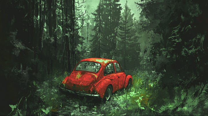
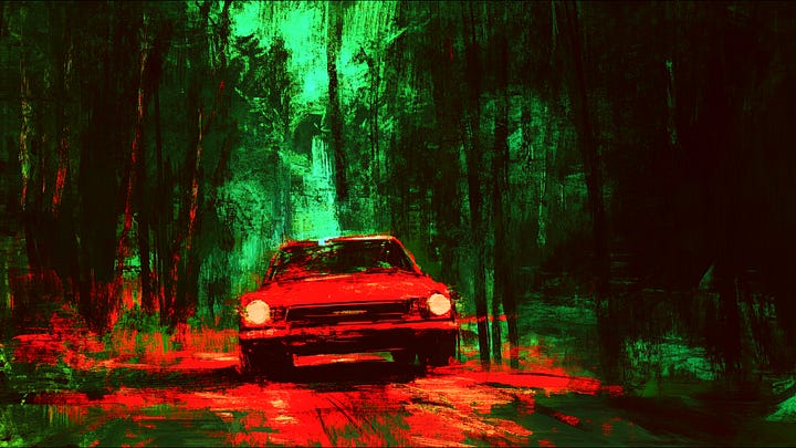
It depends on how you use them. Remember when I said that harmonies are not the whole story? The forest on the left is less saturated, there’s less luminance contrast, and more chromaticity variation. Advanced words that may be worth more than triads and complementaries.
But look at THE MASTERS!
Earlier, when I showed these two images, some of you shouted “BUT YOU DIDN’T MAKE IT LOPSIDED! It turned into a split complementary!”
You’re right. I tried to avoid making a new harmony, but it was impossible. Move the dots at random and they still form some harmony.
This is how teachers perpetuate the lie of the wheel. They show you the works of masters and reveal the “perfect fit.”
With six harmonies to choose from, you’d be hard-pressed to find an image that doesn’t fit one. Teachers often say “I see red and green, so it is a complementary scheme!” Well, if it wasn’t, it would be another.
And also, it isn’t actually any of the schemes. Not really.
Let me show you something…
I’ll pixelate that Munch painting and sort the pixels by hue from left to right, and saturation from top to bottom.
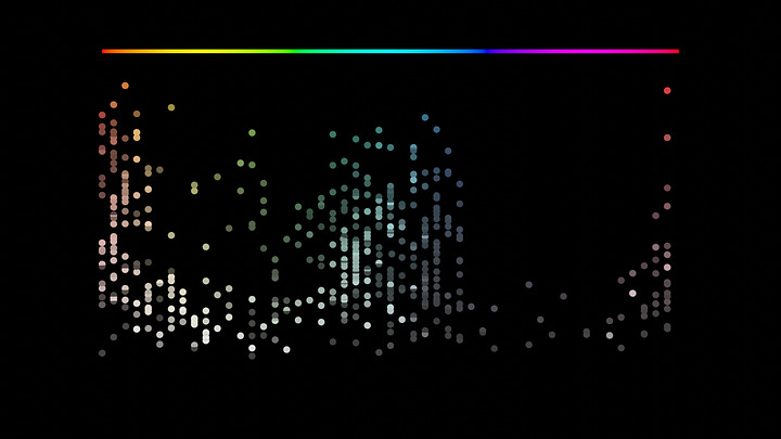
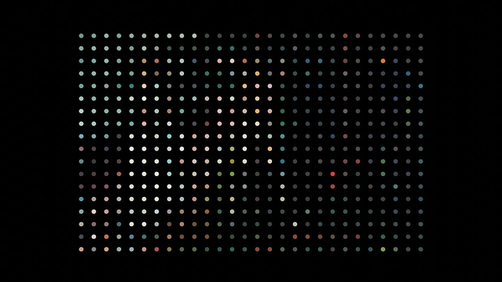
Then I spin the chart around to go in a circle. The more pixels I sample, the more accurate the chart. It becomes obvious that there is more to say than “this is a complementary scheme.”
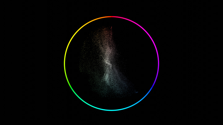
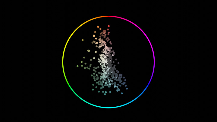
This plot is called a vectorscope. Using this, we see more of the story.
The most common hue here is cyan
The strongest hues are blue and red
The desaturated areas lean cyan
The image has a neutral white balance
Even this painting with super-saturated, super-clear color is all over the scope. There’s no neat division like the color wheel pretends.
If you’re serious about color, ditch the wheel and learn the scope. Stop fooling yourself with simple tools. Harmonies seem neat, but real art is more complex than four points on a circle.
The color wheel is not even real
It's tempting to see the color wheel as a law of nature—as if we didn't invent it but discovered it.
But that's not the case. We did invent it. Or, a poet did, in the 1800s.
With this one illustration, Goethe birthed BOTH the superstition of the color wheel and the superstition of color psychology (which I get to next week.)
But he screwed up. It’s missing two colors.
Goethe thought the primary colors are red, blue, and yellow. They are in fact cyan, magenta, and yellow, as your home printer already knows. In Goethe’s system, you can never mix cyan or magenta. He didn’t even know the colors exist. (Don’t blame him; exotic paint was hard to come by in 1810.)
A color wheel based on the real primary colors looks a little different. The complementary to red is not green, but cyan. The complementary to yellow not lilac, but blue.
So this is the “real” color circle. A physically accurate color circle. The one we discovered as a truth about nature. And when I analyze that Much painting with this new color circle, the neat symmetry falls apart.
The system artists have been using is… Wrong? No, I can’t even say that, because the new wheel is no better. Neither wheel is handed down from God. There’s no magic. They are just two ways to organize color in a circle, useful for little more than mixing paint.
Inspiration
It’s been five+ years since Microsoft launched a series of motion graphics pieces in their then-new material design aesthetic, and I have seen no one do it better since. These pieces are just stunning.
This one on fonts is my favorite.
And this one about dark mode is great.
Pro tutorial
I have mentioned Blender Studio before, but I have to call out this by name. Stylized Character Workflow by Julien Kaspar is just amazing. The full workflow of making a high-quality character for animation.
A tip
Working with 8-bit camera footage is a pain. AI can help.
If you upscale your footage then downscale, you can get a higher bit-depth.
The reason is that the AI is “inventing” new pixels between the existing ones. When you downscale, those new pixels are blended with the original ones. Thus you get more colors to work with.
It’s not the same as good raw footage, but it goes a long way.
(Make sure the project where you downscale has a higher bitrate.)


